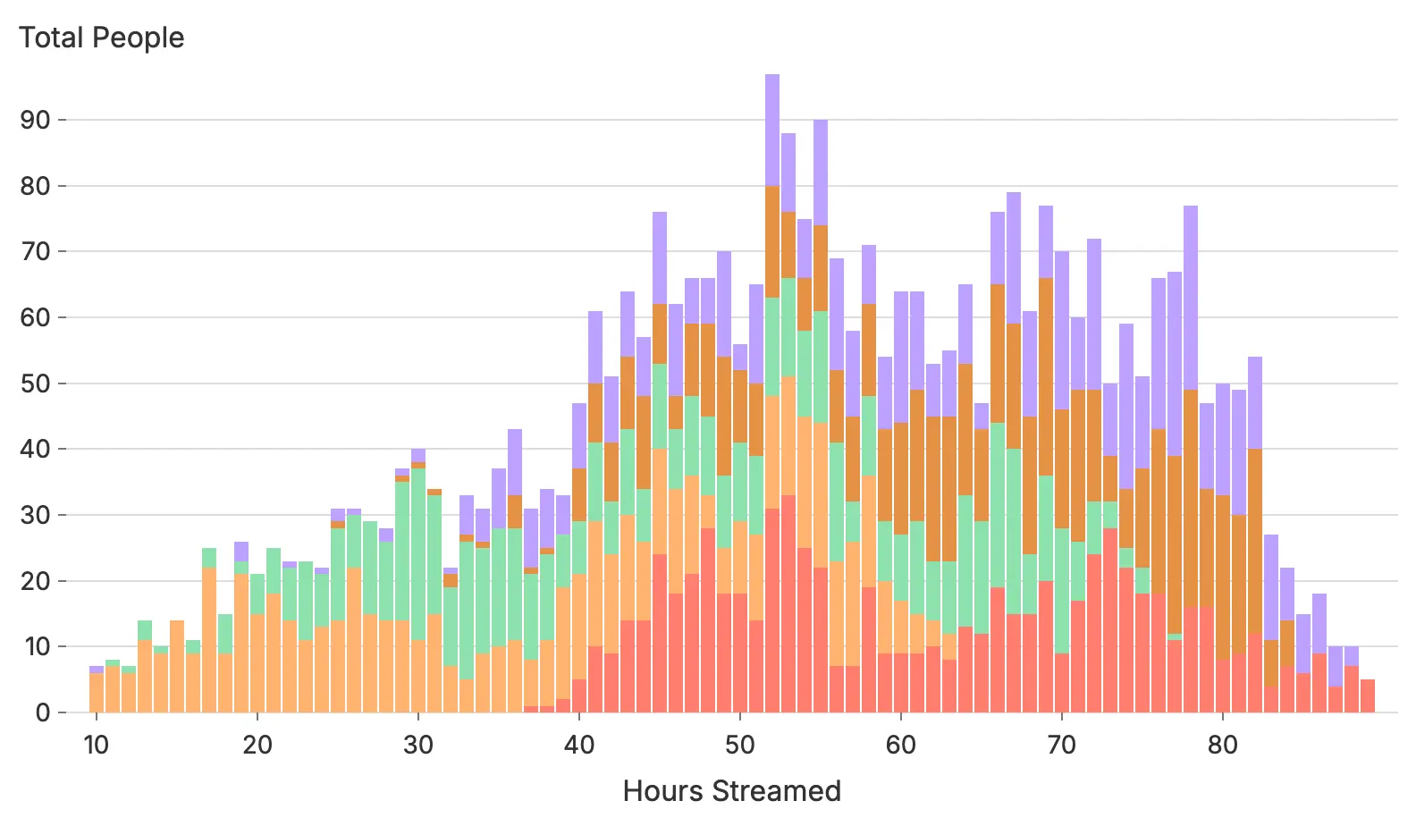
Building the World's Best Charts
Thorntale helps you tell stories with data. Any good storyteller knows that if your materials don’t look pretty and professional, the content won’t be trusted. To that end, people spend hours perfecting wording and slide layouts; but in existing tools, charts still get left in the dark ages.
At Thorntale, storytelling with data is the priority, so we needed to make charts look as good as the rest of your content. We knew that choosing some off-the-shelf charting engine wasn’t going to be good enough.
Instead, Thorntale is building the world’s best charting engine, from scratch.
The goal? Every chart in Thorntale automatically looks like it was drawn by a professional designer.
The Web is Responsive: Charts Should Be Too
Thorntale is making presentation software, but we’re also well aware that presentations are consumed in many different ways. The expected face-to-face-with-a-screen way, but also embedded into emails, viewed on tiny phone screens, or skimmed on the web.
We need our charts to look perfect at every size, not just the “expected” one.
To that end, charts in Thorntale do some things other charts don’t:
- Axes rescale to fit the current display
- Text is shown or hidden based on how much space is available
- Bars & lines are drawn correctly on high resolution screens
- Tables are scrollable, so you can have as much information as you need

Date Axes Shouldn’t be an Afterthought
From our observations, easily two-thirds of charts used in a business context are time series. Showing a metric over time is inherently powerful, and easy for viewers to understand.
However, most charting tools show date axes as if they were any old ordered numbers.

The better tools at least choose reasonable date intervals.

And the worse tools don’t even put the dates in order automatically.

We’re building Thorntale’s charts to display great date and time axes at every scale.

Branding Actually Matters
If you look at enough charts, it will start to become obvious which charts were made by a computer, and which had a human touch. A huge part of that is how similar the chart looks to its surrounding content: colors, fonts, and the like.
But in most tools, if you want to update a chart to your brand’s colors, the only way to do it is to select colors for each series by hand. Maybe your company has a nifty list of approved colors; but you still have to apply them manually, on every chart.
Don’t even ask about fonts.
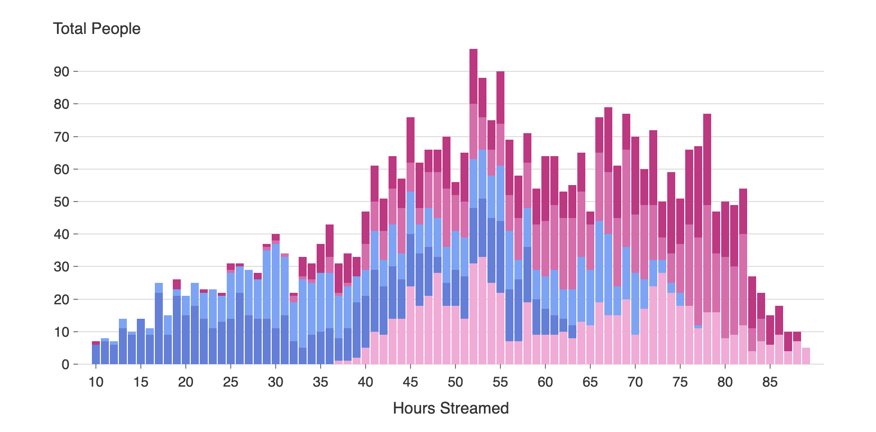
But Thorntale’s charts integrate with the theme of your presentation, out of the box, by default. Charts actually look like they fit in the design. And you don’t have to put in any extra work to make them.
The chart below is colored with Thorntale’s corporate theme, notice how well it fits into this website?

What’s Next?
This post only scratches the surface of all the exciting features we’ve built into Thorntale’s charts and data visualizations. Check back in the future for more blog posts diving deeper into specific chart types and technical details.
We hope you’ll experience the magic of Thorntale’s charts yourself!
